Dashboard, Report, and Map Samples
See the static examples below. All of these reports are interactive and allow for drill down and filtering by any item in the report. Contact us for a live demonstration.
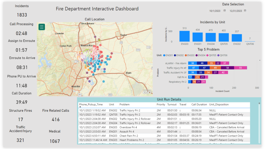
Summary Dashboard
A fully interactive dashboard with summary data available in a single view. Get the big picture with this view and then drill down with the call details. With the date selection feature, you can view years or days worth of data. Every measurement on this page is filtered based on date, unit, call location or problem and changed with the click of a mouse. Let us demonstrate these capabilities to you.
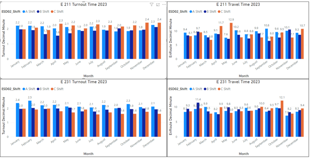
Unit dispatch performance by Month
View unit and shift response performance. This view shows each company’s response performance over a 12 month period.
Annual Call Counts by Month
View call totals via line graph. This view shows calls by month with trend line. Filters capture the calls you want to see.

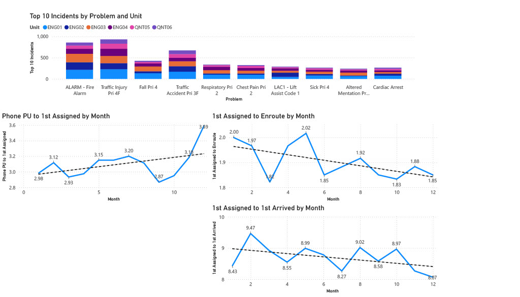
Top 10 Call Types and Times at 90th Percentile
This reports shows the top 10 incidents for the year. Time segments are shown at 90th Percentile. The graphs are fully configurable to display the information you need to see.
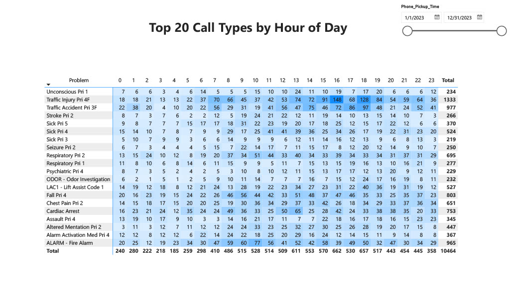
Calls by Hour Matrix
This Matrix shows top 20 calls by hour of day. See when calls are occurring and when your units are busy.
ArcGIS Maps
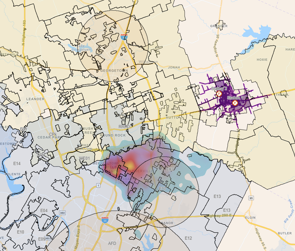
This is sample map of ESD and municipality jurisdictions in Travis and Williamson Counties, call response heat map, Class D and above airspace (for drone operations), calculated travel times and more. Let us show you what we can do for your jurisdiction.
